Call or Text Us Now:
(954) 973-5600
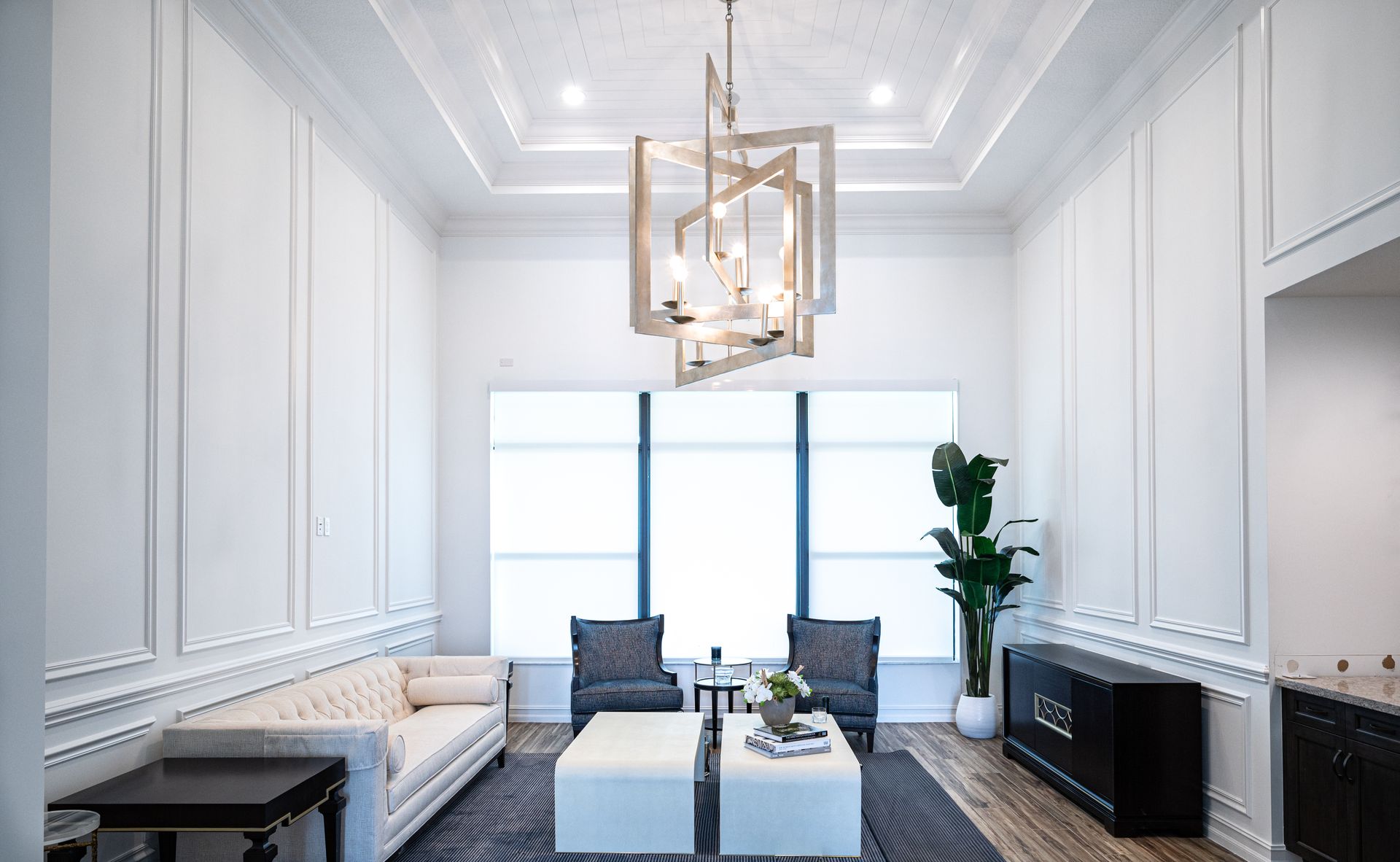
Choosing the Right Colors: How to Match Paint to Your Home's Architecture
May 09, 2024
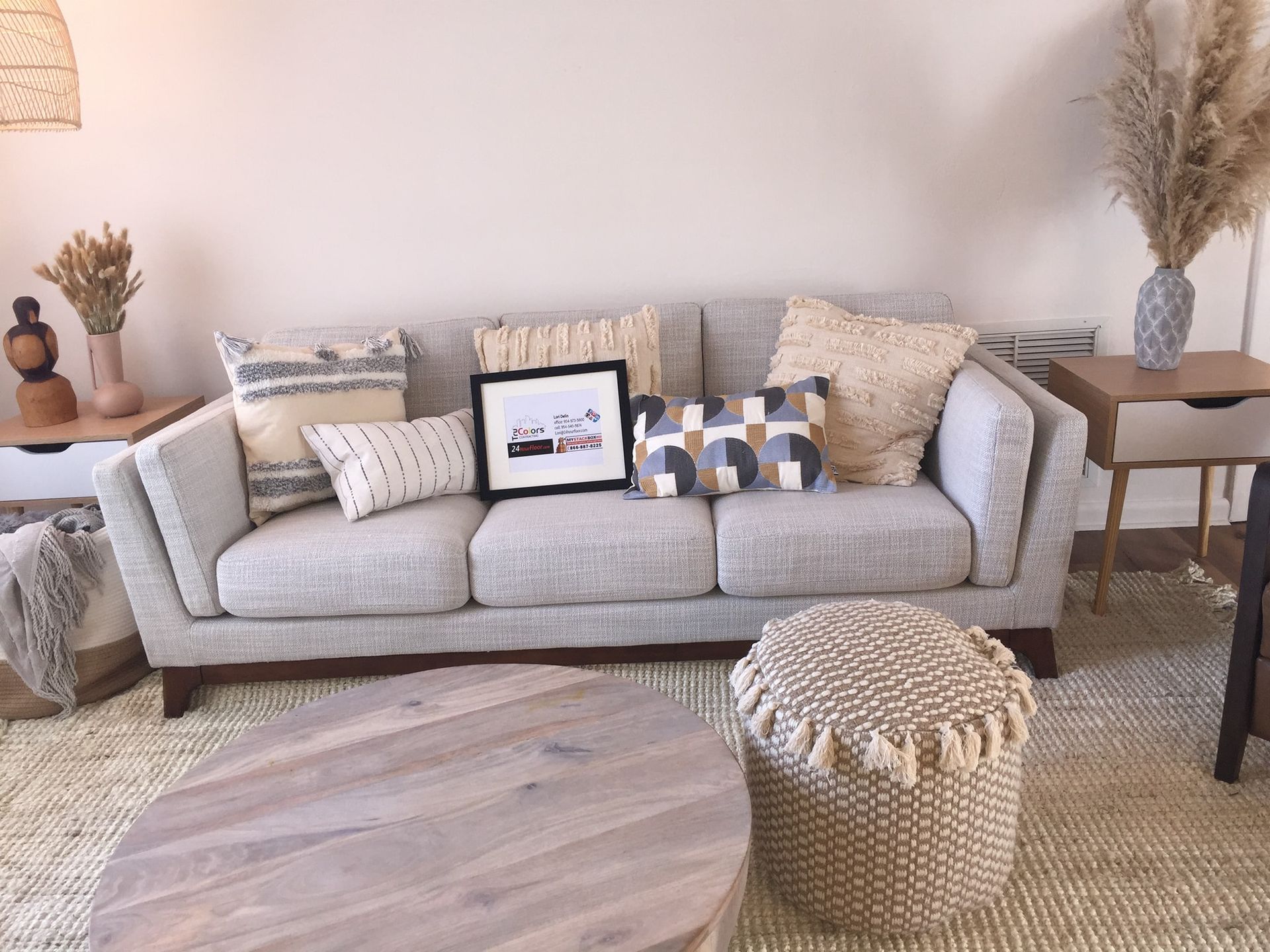
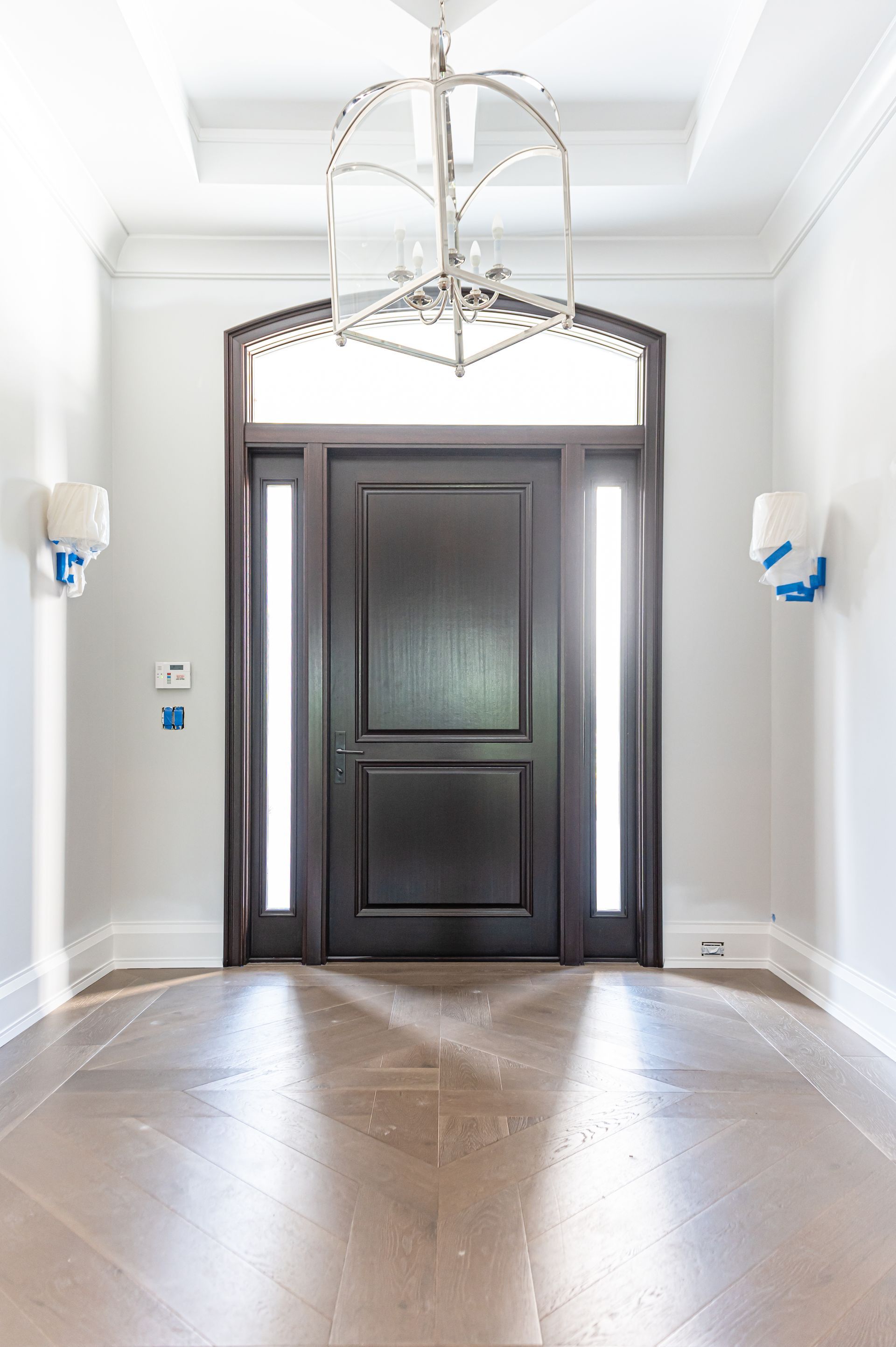
Your home's architectural style tells a story, and the right paint color palette can enhance that narrative, highlighting its unique features and creating a cohesive aesthetic. But with countless colors to choose from, it can be daunting to find the perfect match. Fear not, painting enthusiasts! This guide will help you decode the language of your home's architecture and select colors that sing in harmony.
Decipher Your Style:
First things first, identify your home's architectural style. Common styles include:
- Victorian: Characterized by ornate details, rich colors, and high ceilings. Opt for jewel tones like emerald green, deep burgundy, or creamy whites.
- Craftsman: Embraces natural materials and muted tones. Consider earthy greens, warm browns, and calming blues.
- Mid-Century Modern: Known for clean lines and bold pops of color. Play with vibrant oranges, mustard yellows, and deep teals.
- Mediterranean: Evokes a sunny and airy feel. Embrace calming whites, cool blues, and terracotta accents.
- Contemporary: Flexible and minimalist. Experiment with neutral palettes, including greys, beiges, and taupes, with pops of accent colors.
Matchmaker, Matchmaker, Make My Paint Great:
Once you know your style, delve into specific color harmonies:
- Complementary Colors: Opposites on the color wheel create vibrant contrasts. Use them sparingly for accents in Victorian or Mid-Century Modern homes.
- Analogous Colors: Neighbors on the color wheel offer a harmonious flow. Experiment with analogous blues in a coastal-inspired home or earthy greens in a Craftsman bungalow.
- Monochromatic: Variations of a single color create a calming and sophisticated look. Explore different shades of beige in a contemporary space or greys in a modern farmhouse.
Beyond the Basics:
- Highlight Architectural Features: Use contrasting colors to draw attention to crown molding, fireplaces, or exposed beams.
- Consider Light and Space: Lighter colors open up small spaces, while darker shades can make large rooms feel cozier.
- Think About Your Furniture and Decor: Your color palette should complement, not compete with, your existing furnishings.
Remember: Choosing paint colors is a personal journey! Don't be afraid to experiment with samples, seek professional advice, and most importantly, have fun! Your home should be a reflection of your unique style and story, and the right paint colors can help you tell it beautifully.
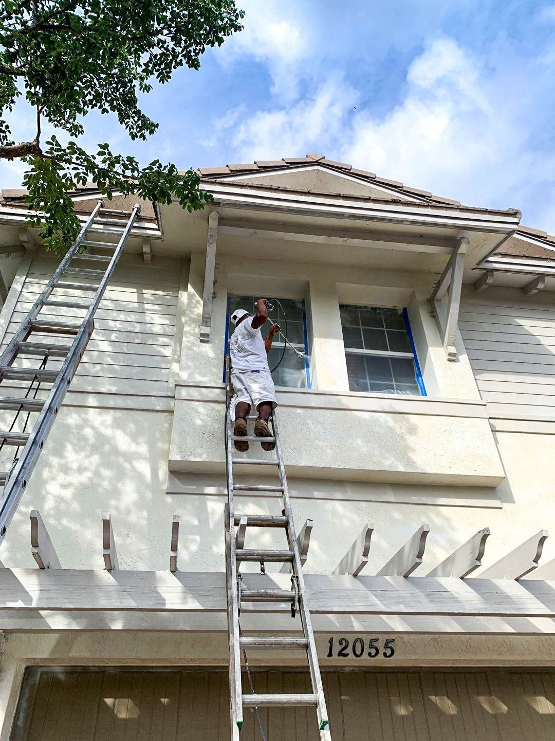
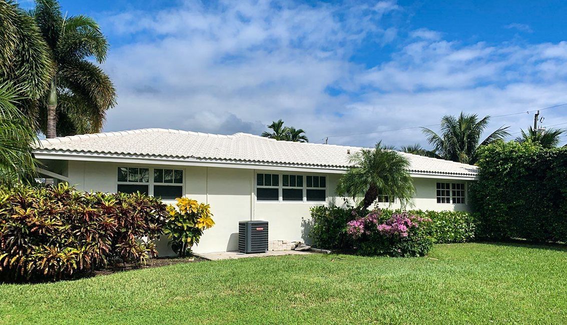
Bonus Tip: Don't forget the power of the exterior! Choosing colors that complement your home's architectural style and surrounding landscape can significantly boost curb appeal.
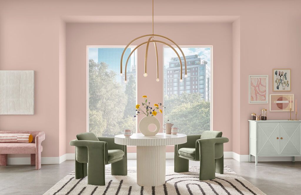
Nostalgia meets modern in Sashay Sand’s blushing beige pink hue. This playful shade brings a lighthearted whimsy to April’s candy-coated color palette that’s made to charm.
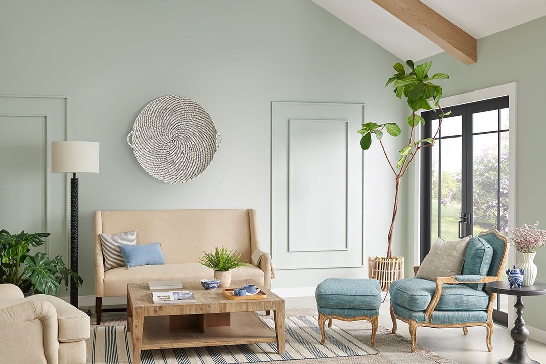
Wade into an elegance that ebbs and flows between the laid-back atmosphere of a coastal look and a more elevated yet approachable modern style. With Silver Strand anchoring the collection, May’s Seaside Tranquility palette weaves a harmonious backdrop of refreshing and relaxed comfort that ties it all together.
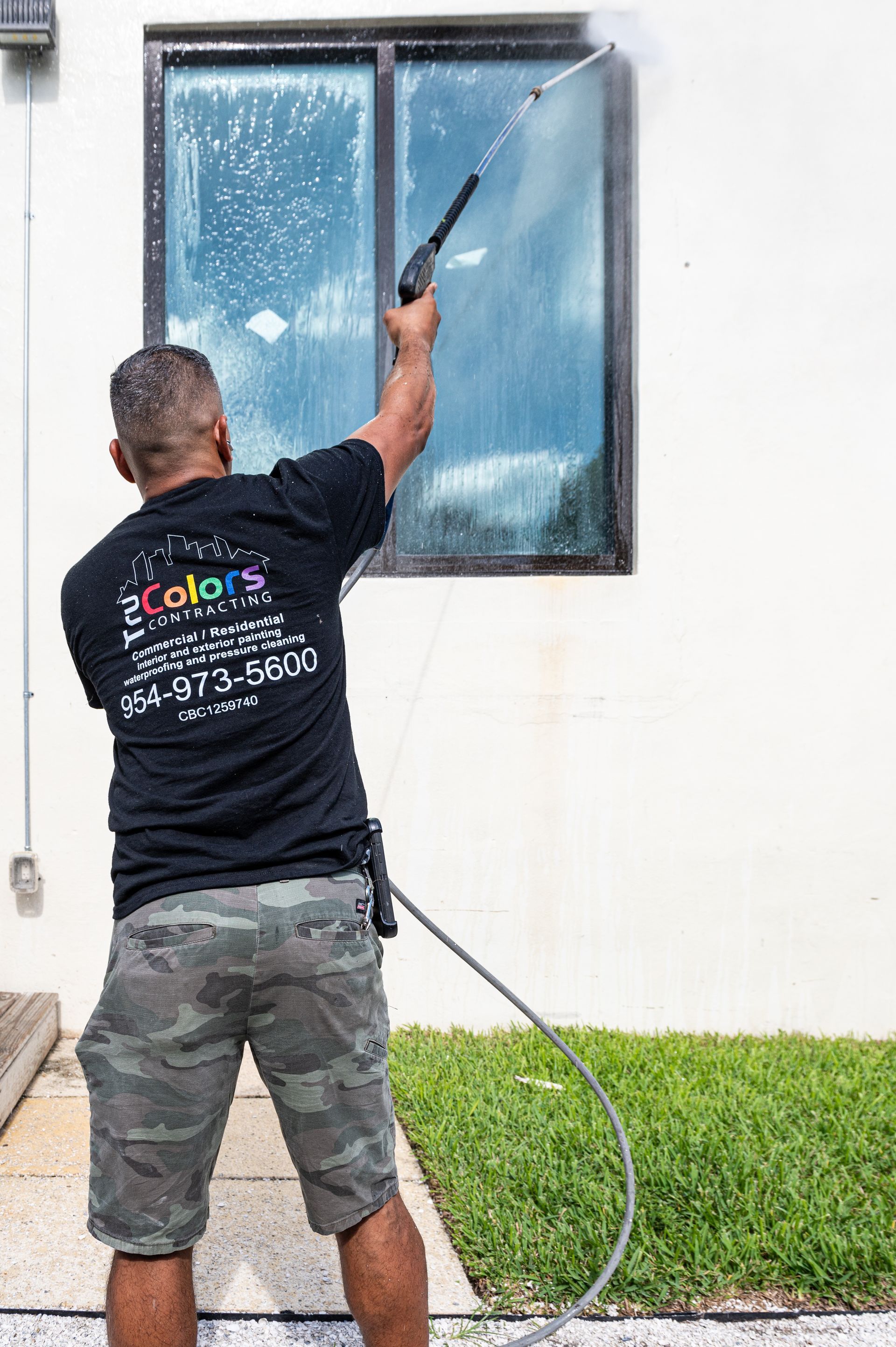
Preserving Beauty and Durability in Florida's Challenging Climate
First impressions matter, and nowhere is that truer than in a commercial setting. Your office, retail space, or restaurant is an extension of your brand, and its appearance sends a powerful message to customers, employees, and potential partners. This is where professional commercial painting comes in, playing a crucial role in shaping the perception of your business and fostering a positive environment.
Marigold Saffron A vibrant yellow-orange hue evoking warmth, happiness, and optimism. It's poised to find its place in furniture, cabinetry, and various accessories, bringing a sense of healing and positivity.
Wondering how to infuse your spaces with the freshest hues this year? Designers across the Southern states are raving about a palette that's set to redefine interiors in 2024. From serene blues reminiscent of coastal vibes to daring chartreuses and rich mauves, these nine standout shades are making waves in the design world.
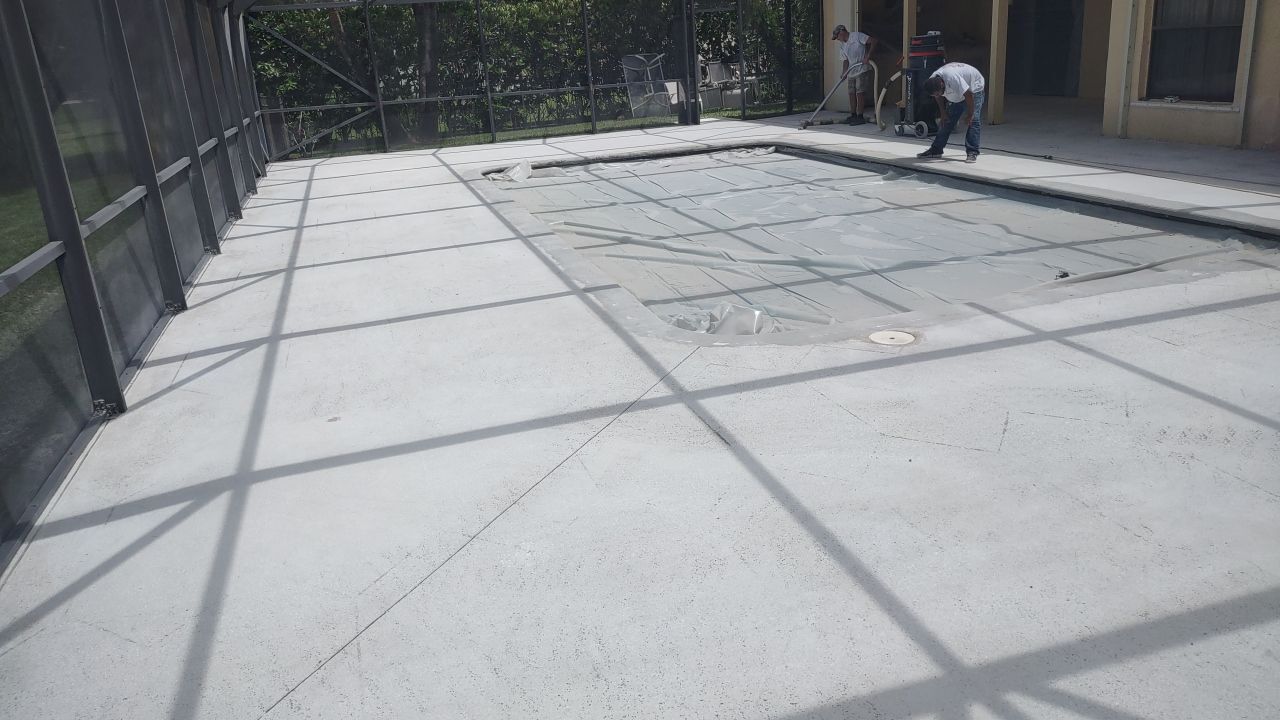
Tru Colors Contracting came to the rescue of a North Lauderdale family after their pool contractor left them clear and dry.
Painted porch ceilings resonate deeply with southern culture. The tradition of a serene blue ceiling isn't just about aesthetics—it has roots in folklore. Legend has it that painting porch ceilings "haint" blue was believed to repel spirits unable to cross the water-like shade.
Color trend forecasters from across the world tapped into the cultural and design zeitgeists to predict which palettes will be popping up the next year—and it looks like life will be a lot bolder in 2024. Color experts are predicting that people will be much more adventurous with their color choices with bright pinks , playful aquas , and rich browns leading the charge. Of course, neutrals will never go out of style, but they are warming up with buttery and blush tones rising in popularity. All experts also agree color will be more personal than ever in the coming years.

Imagine the heartache of watching your sanctuary, your haven, succumb to the relentless assault of water. A South Florida home teetered on the brink, its walls whispering tales of imminent devastation. But then, a hero emerged—a silent guardian known as waterproofing.